How To Make The Formovie Theater Look Its Best!

The Formovie Theater is one of the most popular ultra short throw projectors of all time. With such incredible performance at a very reasonable price, it’s no wonder this Formovie laser TV has been such a fan favorite.
If you want to get the best picture or an image that’s more to your liking from your Formovie Theater UST there are a number of settings you can play around with.
I will be going over all the different menu options that are available on this award winning UST projector below, so read on to find out how to make this little gem sing like a canary, even in a brightly lit living room environment.
These settings are a down and dirty calibration of the Formovie Theater and your results will be different depending on your projector, screen and the room you're watching content. Without doing a full calibration, these Formovie settings will help give you a starting point, you can then tweak the options to your own liking.
Walking Through the Menu Options
There are many different menu options available on the Formovie Theater projector. You can do many things on this ultra short throw projector that you can’t do on many others from white balance to grayscale to a nice color management system or CMS for short. There are a plethora of different settings available for you to change, this guide will walk you through them to help you calibrate your Formovie Theater to your liking.
Settings Menu
To access the settings menu on your projector, you can click the button with the gear on it on your remote. Then select Settings.
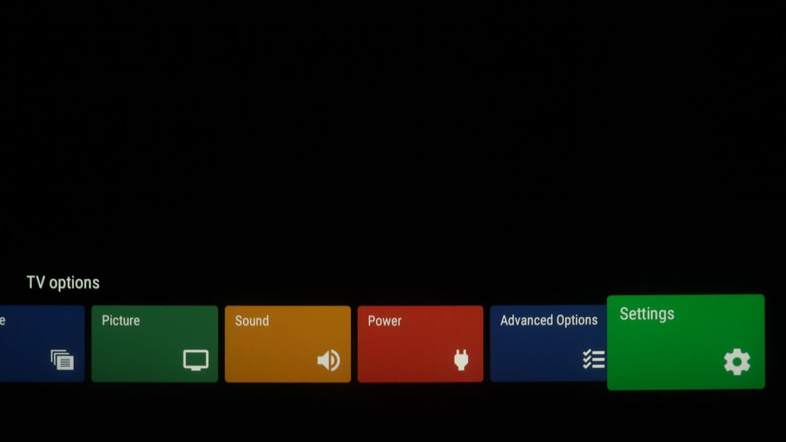
This will take you into the settings Menu. Start by selecting Projector.
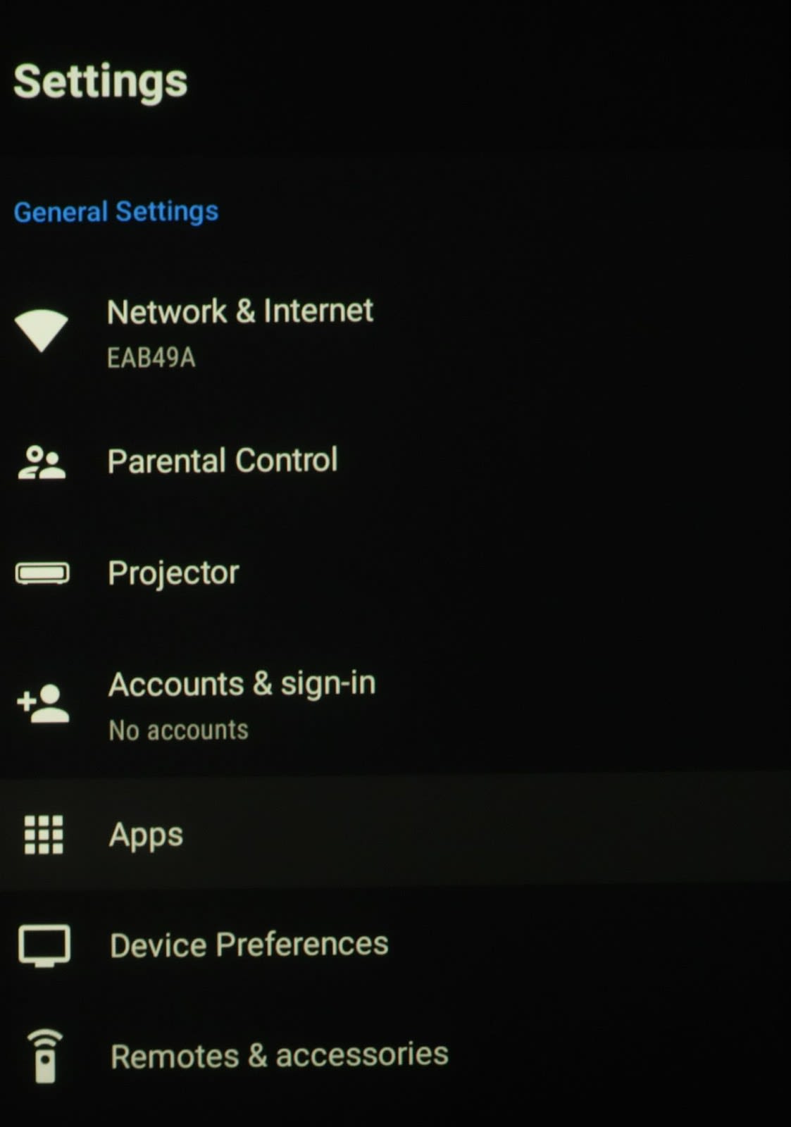
Projector Menu
The projector menu gives you options for setting up your projector including Focus, Keystone Correction and Brightness Mode.

You’ll typically want to skip using Keystone Correction as it can degrade the resolution of your image. It’s better to physically adjust the projector itself to align with the screen.
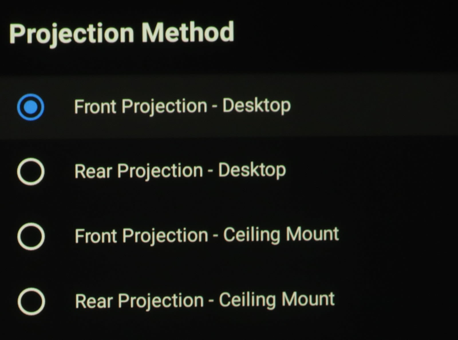
If you wanted to do rear projection or mount your Formovie Theater from the ceiling, the Projection Method controls will allow you to reverse and flip the image accordingly.
I’d recommend keeping the The Infrared Body setting on so that the light automatically dims to avoid causing eye damage. When you’re aligning the projector however, you’ll want to have this turned off so the light doesn’t keep turning off while you try to make adjustments.
What to look for in the focus screen?
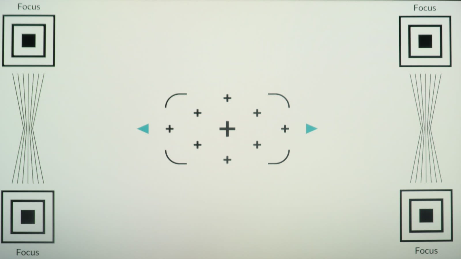
When you are focusing this projector, the key thing to look for is the upper right and left corners where it has the word FOCUS. You want to press and hold the left and right arrows in the focus screen using your remote and while doing this, you want to look at the actual word FOCUS and look within it, in the black area. As you press the button to the left or right you will usually see some color bleeding into the black area, usually green. As you get closer and closer to optimal sharpness, you will see the most amount of black and the least amount of color bleed along with the sharpest edges of the word. You can then just press and release the left and right sides to fine tune the focus at this point.
One of the known small issues with this projector is that it can be difficult to get very crisp focus, in the top corners, namely the top left. The best thing to do initially is to turn on the projector and let it warm up for 15 to 30 minutes first.
A key to get this as sharp as possible is to make sure that your physical set up is the best it possibly can be, square and plum to the screen. An easy way I do this is by making sure when I place the projector on the stand or a piece of furniture that it is on in front of the screen, that I look and make sure the bottom of the image is straight and parallel with the bottom edge of the screen and then I pull it in or out to match the width. While I do this I ignore the sides and top at this point.
Once I know I have it flat and parallel with the bottom edge of the screen, then I evaluate the rest of the screen on the sides and top. From here, 99% of what is left is using the front left and right adjustable feet to tilt until the image is square and matches the screen surface. You may have to twist the projector like a steering wheel a little as well as maybe move it slightly in or out in order to get it just perfect. The key component in all this is making sure that your screen is parallel, flat and level on your wall along with the same for the piece of furniture that your projector is sitting on. You might also need to prop the feet up with shims to get the picture perfectly lined up.
What do the projector’s laser brightness modes do?

This is the brightest of all the laser modes. I personally use this for displaying HDR and Dolby Vision to get the brightest image on the screen which can help with these modes.
This is the next brightest laser mode. It is about 5% less bright than the office mode. This mode can still work well for a HDR but I believe is more suited for your SDR viewing, such as broadcast TV and sports watching.
The dimmest of all the laser modes is the night mode. This mode is about 35% less bright than the office mode and 30% less bright than the viewing mode. This mode is pretty dim, so the situation I would use this mode for would be if you have a very good light controlled room and are shining on a standard white screen instead of a lower gain gray or ambient light rejecting surface.
What are the different picture modes good for?
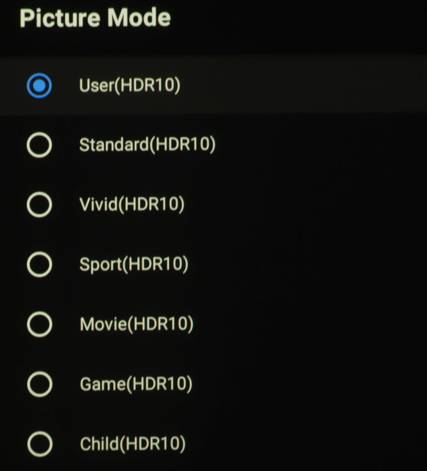
There are a total of sixteen picture modes on the Formovie Theater. Seven of these modes are used for both SDR and HDR (User, Standard, Vivid, Sport, Movie, Game and Child). The final two are Dolby Vision Bright and Dolby Vision Dark, which as you can tell affect the image only when in Dolby Vision mode in the projector is receiving a Dolby Vision signal for display.
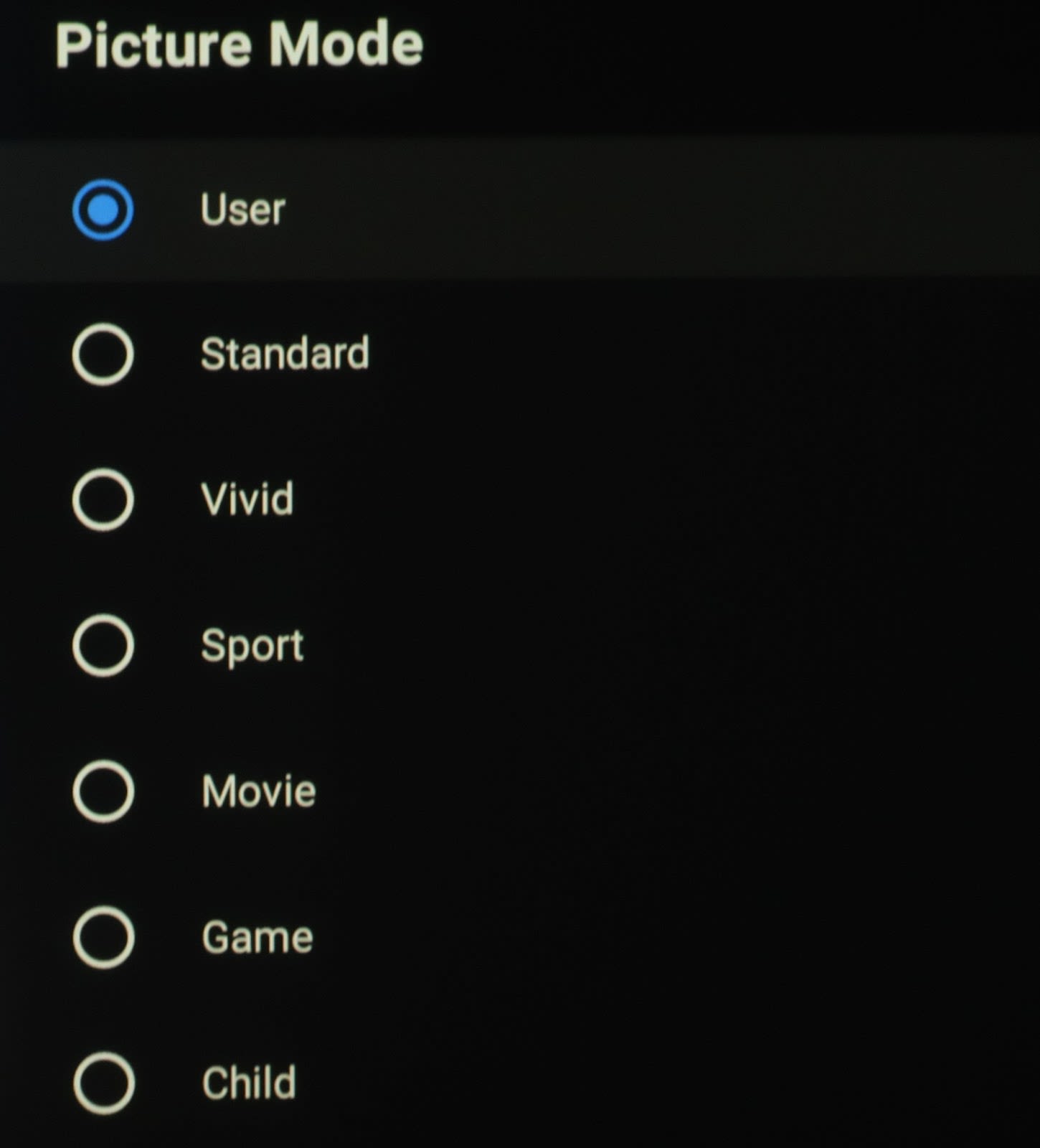
One thing to note is that when you change HDMI inputs the picture settings don't carry over from one port to the next.
All of the picture modes are able to be configured in the same manner if that is how you want it. The only differences between all of the modes or what each one defaults to when selected for features such as color temperature, gamma, and the image enhancements mainly under the advanced menu of each picture mode and at what strength they are set to by default.
This mode is the mode I choose to use because it offers the most amount of options in the menus and allows me to tailor the image the most and the way I want it. This mode and all of them out of the box when measured shows excessive blue or a lack of red and green, which can be pleasing despite being inaccurate.
This mode out of the box is pretty much the same as the user mode as far as the color temperature and grayscale and color gamut that it uses. It is ever so slightly brighter than user mode but you can’t tell with your naked eye because they are so close. As with the user mode, it also has excessive blue in its default mode, or you can say a deficiency of red and green. It is pleasing to the eye in its default mode but you should know that it is not accurate as far as video standards go, so it is a choice of what you prefer.
This Picture mode has a similar brightness in all laser power modes as the previous two, user and standard. It is slightly higher by about the same percentage as those two modes as well. This mode boosts up contrast to 60 and saturation to 70 which causes its vivid oversaturated appearance which is where this mode gets its name.
Sport mode has the same brightness as vivid mode but the contrast is only boosted to 55 and saturation is boosted to 60 at their defaults in this mode. As mentioned in the beginning of the section, the main differences between all these different modes are the advanced features that are activated by default when you select them such as MEMC and other so-called enhancement features.
This mode once again changes contrast and saturation to emulate more of a film look while also changing different default special features under the advanced menu which all appear to go disabled which allows it to give it that dimmer more cinematic look, mainly used for dark rooms or if in the living room with the lights off and at night when it is movie time. Contrast drops to 40 and so does the saturation. Also the laser brightness drops in each laser mode by about 300 to 400 lumens.
This mode is the same laser brightness as movie mode but the contrast and saturation drop back to their normal mid range values at 50. This mode disables as much of the processing as possible so it doesn’t affect your lag time when you play games. It activates the game mode under the advanced video section of the menu and allows you to activate ALLM which means auto low latency mode if you would like but other options like PC mode and de-counter and MEMC are grayed out and not able to be selected at all in this mode.
This mode boosts the brightness back up and it goes even higher than the other brightest mode which was vivid by about 60 lumens. It drops the contrast down from 50 to 45 and is the only mode that starts out with dark gamma setting and a color temperature at standard instead of warm. Other advanced video options are changed as well but you don’t have the option of choosing game mode or PC mode under this sub menu.
For some unknown reason when you present a Dolby Vision signal to this projector, which is Dolby Vision capable like many of the newer ultra-short throws are, the lumens drop by almost half from about 2950 peak measured to 1,500 to 1,600 lumens in the brightest Office mode. I don’t really understand why they choose to do this because it certainly doesn’t give this projector’s native Dolby Vision a good look and most people realize and it is known that Dolby Vision is supposed to be superior to standard HDR10, but in this case it is not and the image comes out appearing very dim and dull, which is the opposite of what Dolby Vision is supposed to give us. There are ways around this using third-party devices such as the HDFury Vertex2. We will be discussing this and some additional products and tweaks you can do to maximize the image quality on this already fine projector or Laser TV in a future article. Many of the features are disabled when in Dolby Vision mode but you are able to change some things which is good, so you can even tweak in Dolby Vision mode unlike many other TVs that feature this image attribute. When you switch to Dolby Vision Dark nothing in the menus really changes but it does change the curve that it is using for its HDR rendering.
Menu and Picture Settings

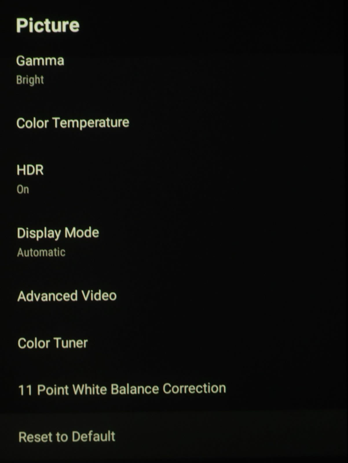
•BRIGHTNESS
-
What does it do?
- Brightness raises the black floor of the image, as it does on all other displays. A lot of people confuse this and think it is a picture control that brightens the entire image, which it kind of does but it does it from the bottom up and doesn’t affect the peak whites as you would think by the name.
-
When should I use it?
- You should use the brightness control to bring up details in the shadows to their proper level to be seen the way the creator of the content intended.
-
What should I set it to?
- The correct answer is to use what is called a PLUGE pattern which has a 0% black background with three black patches on top of it, one of which is below the video black level, one at the 0% black level and the next one a little above 0% black, usually about 2%. Then you adjust the brightness control while you have this pattern on screen so that you can just barely see the brighter than black 2% patch. Most people don’t have access to something like this or know that they do, because these patterns can be readily found online for free.
- If you don’t use a pattern or have access to one for some reason then I would say that you should play a known very dark image with a lot of shadow details such as something like the beginning of the movie Blade Runner 2049 when Ryan Gosling‘s character is arresting the android played by Dave Bautista.
- Another great example is in the movie 1917 where the main character is knocked out and fell down a dark stairwell and then he comes to while laying in complete darkness on a landing of the steps. This is at around the one hour six minute mark of the movie. You want to go ahead and set the brightness where you can see all the detail in the darks but when you play a normally lit scene, it doesn’t look too bright or washed out.
- You should be close to the default of 50, I would say don’t go more than 10 up or down if that. If you do have to use an extreme level and there is probably something else wrong somewhere in the chain.
•CONTRAST
-
What does it do?
- Contrast is kind of the opposite of brightness in that it adjusts the peak white level instead of the black level at the other end of the range. It basically pulls everything up from the Peak whites while the black level is the baseline. Sometimes the black level and contrast can affect each other a little so when you are setting these you should go back-and-forth between them to get it just right on the bottom and top ends of your image.
-
When should I use it?
- You should use it to set your peak white level for optimal picture quality without over blowing the highlights. You should use it upon initial setup to set the maximum white level for all the modes you are wanting to use.
-
What should I set it to?
- As with brightness, there are test patterns to use to set this properly which have patches on them but this time the reference patch is at peak White with two patches, one just below peak white and one just above it. It should be set at the peak white of your video signal and at the parameters that it calls for in that particular video mode. Some examples are standard dynamic range video like broadcast TV and Blu-ray discs, which are usually set to a peak of 100 nits or HDR which is usually set to clip peak white at 1000 nits as the most common format, but you may also set it to clip at levels like 4000 nits or higher, based on what you have your display calibrated to and the mastered level of the HDR source video.
- A good movie to use for this in both SDR and HDR is The Meg. In chapter 8 there is a scene with the boat overturned and the sky and clouds are at extremely high brightness levels (nits) so if you use that scene to set contrast to where you can see all the clouds and the detail within them along with natural blue looking skies between the clouds then you should be very close to a proper level and set up.
•SATURATION
-
What does it do?
- Saturation is an adjustment that adjusts the intensity or amplitude of the primary and secondary colors all together at the same time. As you raise saturation the image gets more colorful and saturated as the name suggests. As you lower it, it gets weaker and weaker with less color.
-
When should I use it?
- You should use it when you need to set up the right color level for each video standard. This again is usually set during initial setup and you use various test patterns to set it correctly, sometimes along with a blue filter or turning your monitor to blue only mode if it has it.
-
What should I set it to?
- I leave this setting at default of 50 for each mode. I do this because I do adjustments with the color management system which adjusts each primary and secondary color individually to the proper Gamut points.
- If you don’t want to use the CMS values, then the best advice I can give would be to use the saturation control to adjust the look of something well known, like face tones and colors, or grass and blue skies. If you don’t want to use the CMS values, then the best advice I can give would be to use the saturation control to adjust the look of something well known like face tones and colors, or blue skies on a sunny day and green grass. A good known reference for red would be to find an image of a Coca-Cola can.
- If for SDR video like standard Blu-ray‘s or even DVDs, you can use a blue filter or blue mode if it’s available and you put up a color bar pattern and look at it through the blue filter and adjust saturation and Hue/tint so that the top and bottom portions of the split color bars all match in intensity and Hue/tint of color.
•HUE
-
What does it do?
- Similar to saturation, this setting affects all of the colors at the same time but this time instead of the intensity or amplitude of the color it adjusts the hue or tint of all the colors combined so as you adjust it you’ll notice things like faces going from normal looking to red if you go one way or normal looking to green if you go to the other way. If you adjust it while looking at a field of green grass you’ll notice it go from being extremely saturated and heading towards a cyan or blue color or if you adjust the opposite way it will start to make the grass appear more yellow.
-
When should I use it?
- You should use it when you need to set up the right color phase/hue/tint for each video standard. This again is usually set during initial setup and you use various test patterns and a blue filter to set it correctly, such as with a split color bar signal like you do with saturation. These two are usually set at the same time since the test pattern and blu filter are needed for both and sometimes they can interact with one another just as brightness and contrast do.
-
What should I set it to?
- I also leave this setting at its default of 50 for each mode. I do this again because I do adjustments within the color management system (CMS) which adjusts each primary and secondary color individually to the proper Gamut points.
- If you don’t want to use the CMS values for Hue as well, then the best advice I can give again would be to use the Hue control to adjust the look of something well known like faces or grass. Adjust these two look as naturally as you know they should look without being too green or red or too blue or yellow for the grass. Use the same reference image of a Coca-Cola can to set the hue so that it doesn’t appear too orange or magenta. It should look like the red logo we all know and love.
- If for SDR video like standard Blu-ray‘s or even DVDs, you can use the same blue filter or blue TV mode if it’s available and put up the same color bar pattern and look at it through the blue filter and adjust Hue/tint so that the top and bottom portions of the split color bars all match in their Hue/tint.
•SHARPNESS
-
What does it do?
- Sharpness is supposed to increase the actual crispness of the entire image when added, but what really happens is it just gives false outlines on edges of objects to make the image appear sharper. If you turn it up too high, then you will get a white outline around objects.
-
When should I use it?
- You should use the sharpness control very judiciously. Sometimes it can help with older, lower resolution type images to help them appear to be sharper with more depth and detail, but you want to be sure not to use too much because then the image will take on a very digital, over enhanced looking appearance and it can actually increase the appearance of noise and natural film grain. This can make it look very unnatural.
-
What should I set it to?
- The best way to set sharpness, as with just about every other video attribute, is to use test patterns. The one that is best to use for setting sharpness is a pattern with a solid gray background at around 50% gray along with some horizontal and vertical geometry lines and circles that are black. As you raise and lower sharpness, you can start to see the white edge outlining the black lines. You want to set sharpness to where there is a clean transition from the black line to the gray background with no white ghosting or outlining in between the edges of the black line and the gray background.
- If you don’t have access to any kind of test pattern then you can use a scene from a movie that has fine lines in it, maybe from something like a window with vertical or horizontal blinds and sunlight coming through. As you increase and decrease sharpness you can see the same type of effect with false outlines. Another good thing to try it with is in a scene with a close-up of someone’s head and hair where you can see the strands of their hair starting to get over enhanced looking with white edges and outlines within their hair.
- In my setup and calibration of this projector for the 2022 Laser TV showdown, I left it at its default of 10 but in my personal use I find a setting of 6 to 8 to be the best depending on the source video. Use the above suggestions to set your sharpness control for your particular system.
•GAMMA

-
What does it do?
- Gamma is an adjustment and setting that changes the Luminance tone of the image based on where the brightness and contrast controls are. Those are the endpoints and baseline that stay the same when you adjust and gamma but everything in between can change. As you go down in power law gamma numbers the image will get brighter and as you go up they will get darker. The normal gamma used for video is usually 2.2 or 2.4 for SDR video and an absolute gamma is used for HDR based on the ST.2084 standard.
- Gamma on displays and projectors are called an EOTF, or electro optical transfer function, and is the inverse of what a camera does which is an OETF or optical electro transfer function. This is basically saying in the camera a physical and visible image of reflected light and colors goes through the lens, is captured by the imager chip and is converted into an electrical signal. Then after it is stored or sent through wires or radio/TV airwaves to a display at the end of what could be a very long signal chain, that display needs to convert the electrical signal back into visible light and colors based on the technology being used. Due to how the technology was used on original display devices which used cathode ray tubes or CRTs as they are known, this nonlinear Gamma was created to replicate the image as close as possible on screen what was originally seen in the camera.
-
When should I use it?
- You always need to use some form of gamma to recreate the image on the screen. Which one you use depends on the standard of the video you are playing, such as the examples I mentioned above with standard definition range or high definition range videos. Since the PQ absolute gamma curve of HDR doesn’t change based on the brightness of the display, then you need to use something called tone mapping which remaps the colors and brightness from its absolute values in the HDR video down to the values that the display can render. For a SDR video signal, this is not an absolute Gamma so as you change your display and how much brightness it has, the power law gamma is not absolute, so it can be scalable to match the brightness that is available.
-
What should I set it to?
- Usually in bright rooms you go with a lower gamma value of 2.2, 2.0, or even 1.8. In darker more dedicated and light controlled rooms like a dedicated Home Theater then you start to use higher values such as 2.4 and in the case of true DCI you actually use 2.6.
- For the calibration from the Laser TV showdown I used the BRIGHT gamma setting for both HDR and SDR, which upon measurement was closest to reference.
•COLOR TEMPERATURE
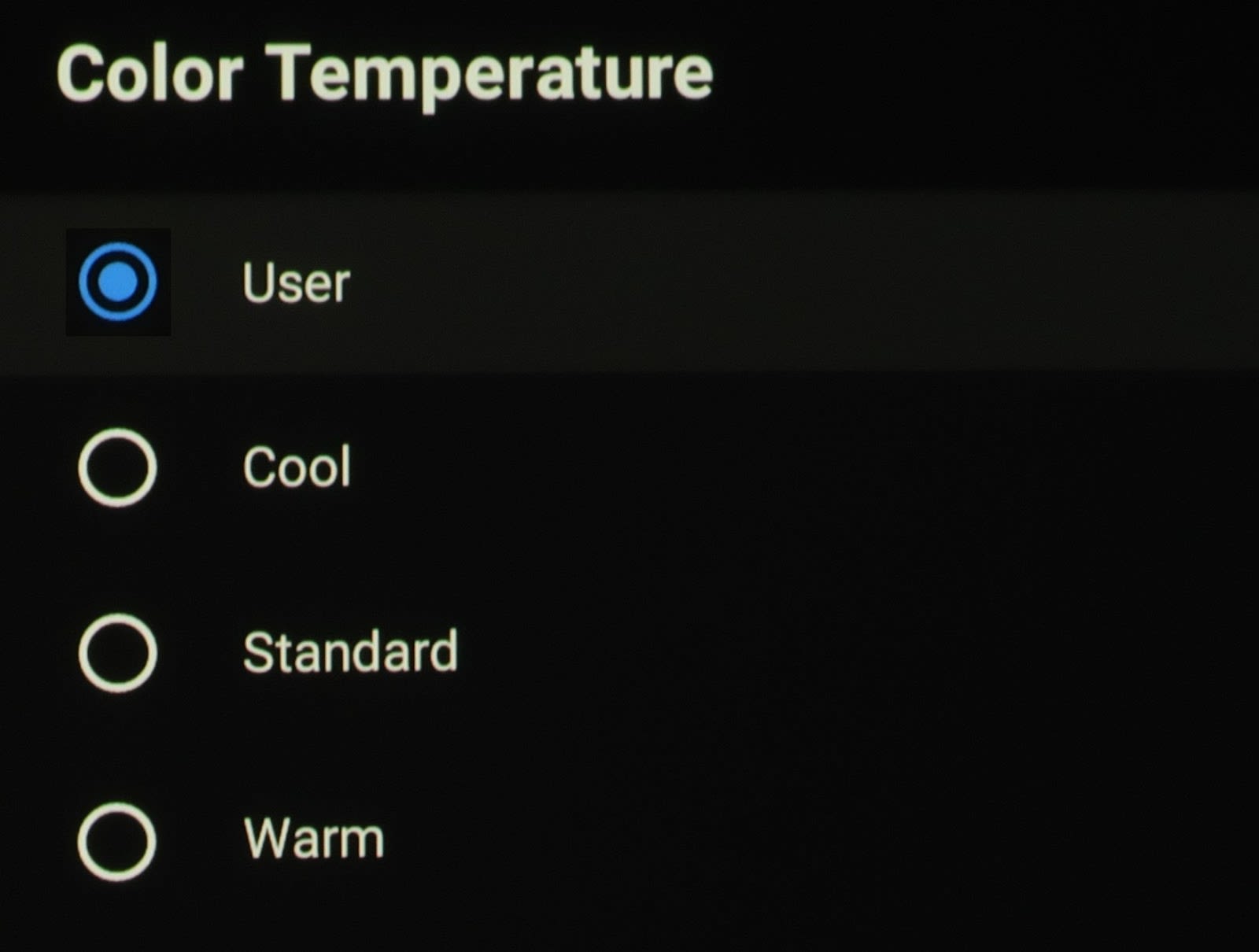


-
What does it do?
- Color temperature adjusts the mixture of the three primary colors of red green and blue to present what is known as the image’s temperature or what appears to be the overall hue of the image on the screen. A cooler color temperature mixes more blue and it makes whites appear much whiter and also kind of starts to wash out the image if it is set too high. A warmer color temperature appears more red as you go warmer and warmer. The color temperature reference for video is standardized as 6500 degrees kelvin or D6500. Warmer temperatures go below that such as 5000 K and cooler temperatures are ones that are above at values like 9300 K.
-
When should I use it?
- This should be used upon initial set up as with most other settings. You should use it to make the image on the screen appear as natural and lifelike as possible without making things like faces too red like they are sunburned or making skies and clouds whiter than they are intended to be based on the original captured video and intent.
-
What should I set it to?
- Color temperature will be different for every environment and system. So where exactly you set it will be slightly different for everyone in the environment and equipment each person has. The absolute best way to set it properly is to use a test pattern generator or other test pattern source along with calibration software such as portrait displays CalMAN paired with a decent colorimeter or spectrophotometer.
- We know that most people do not have calibration equipment so the best thing to do to get it as close to D65 as possible is to set the color temperature in the menu to warm and then use a mode such as user, standard, movie or game and then also make sure in the menus that blue stretch is off and low blue light is set to high because this projector out of the box is very blue which means it is a cool color temperature. This will get the image as close as possible to the reference white point. Sometimes though when you are watching in a brighter lit room and the source is just some thing like standard broadcast TV than a cooler color temperature is more pleasing and can be used so you could try the standard color temperature.
- We used the user color temperature setting for both SDR and HDR and customized our set up with the following values:
Color |
SDRCOLOR TEMPERATURE (USER) |
HDRCOLOR TEMPERATURE (USER) |
|---|---|---|
Red Gain |
-33 |
0 |
Green Gain |
-45 |
-1 |
Blue Gain |
-62 |
-10 |
•COLOR TUNER
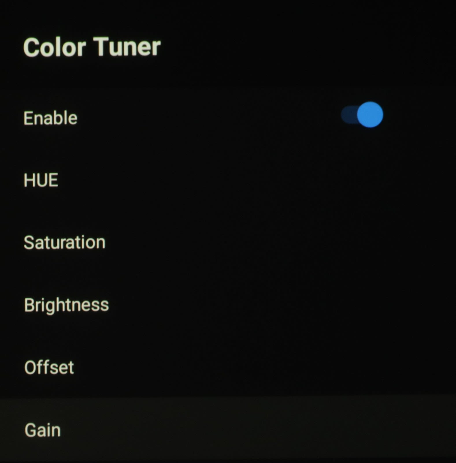


-
What does it do?
- The color tuner is what they call their color management system, or CMS on this particular projector. It corrects the primary and secondary color errors and allows you to dial in those colors to their respective reference points on each standard’s color gamut chart using a color meter and software. These are essentially a color saturation, hue/tint and brightness control for each individual primary and secondary color, Red, Green, Blue, Cyan, Magenta and Yellow. These differ from the main menu’s Saturation and Tint controls in that they control each color individually, whereas the main menu controls affect all the colors together as a group.
-
When should I use it?
- This should be used upon initial set up, again as you do with the other settings. You should use it to make the image on the screen appear natural and lifelike in color. Do this similar to color temperature to make images appear as they would in real life, without making faces too red or oversaturated like they are sunburned or making green grass too cartoony, yellow or too deep green or blue skies too blue without its natural gray /blue appearance. As with color temperature, adjustments are intended to make the image appear similar to the original real life images that have been captured on video or to the creator’s intent.
- You must first make sure you are in the same color space mode standard as the video source, such as BT.709, DCI-P3 or BT.2020. On the Formovie, this setting is called “Color Space”, which we will cover later in the article.
-
What should I set it to?
- As always the best way to set this is using a color meter and software. In the absence of that, I suggest you leave these values in their default position and just set it to a color mode that most closely represents a natural looking colored image as you’d see in the real world. Make sure to use a video source that is basic and most lifelike instead of a movie with some crazy filters or mastering to enhance the creator’s intent or convey a certain feeling. It should be just a plain TV type video, like sports or a documentary such as the Planet Earth series.
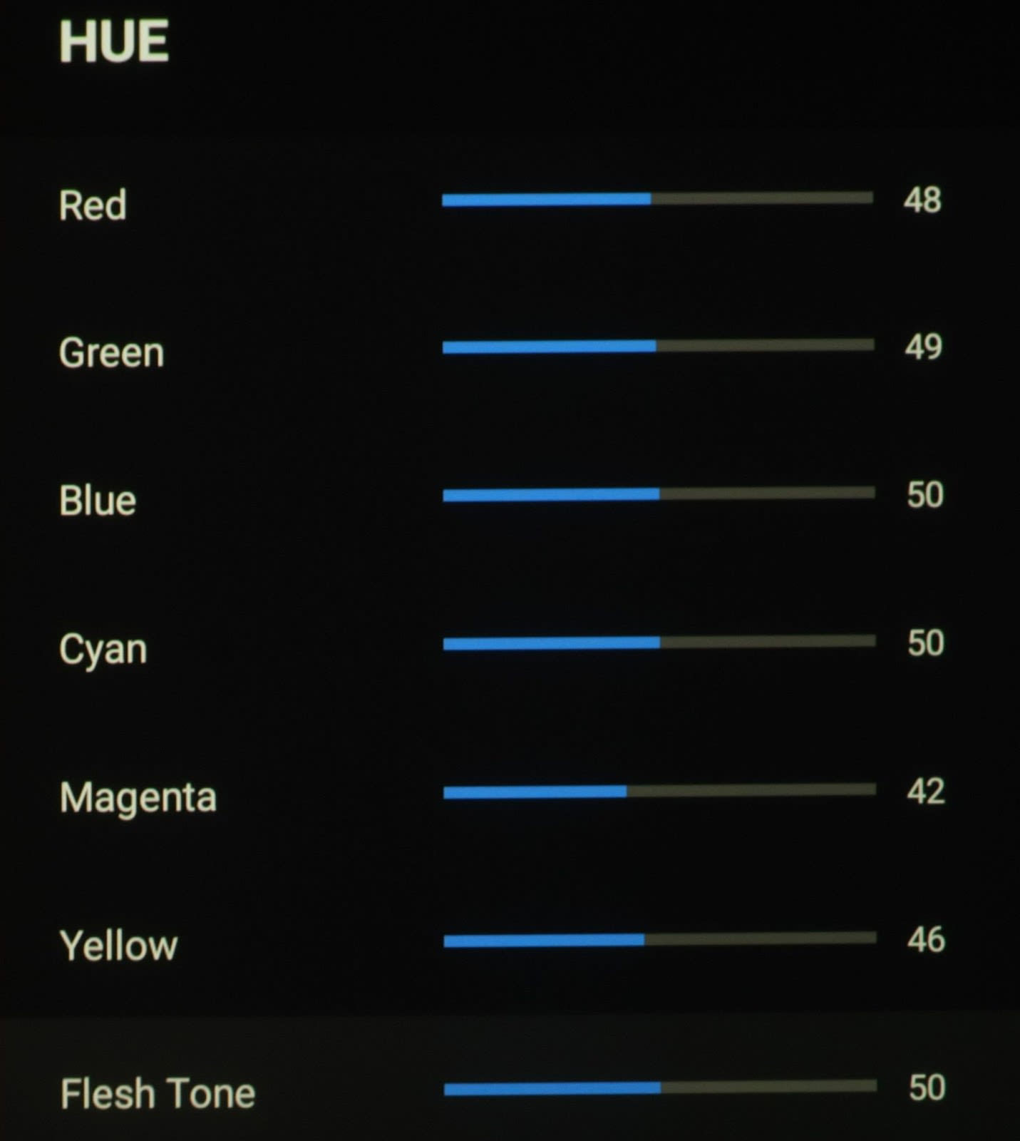
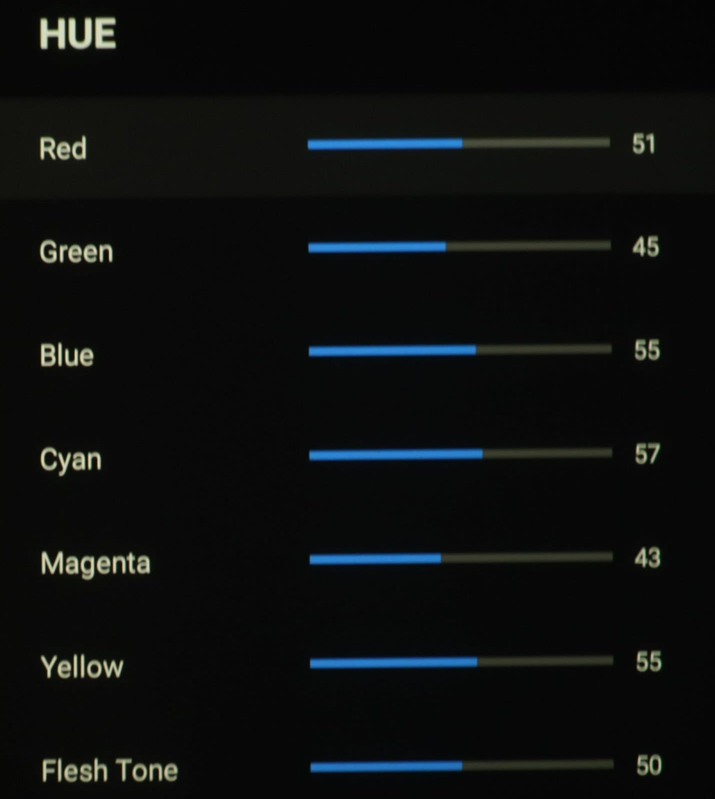
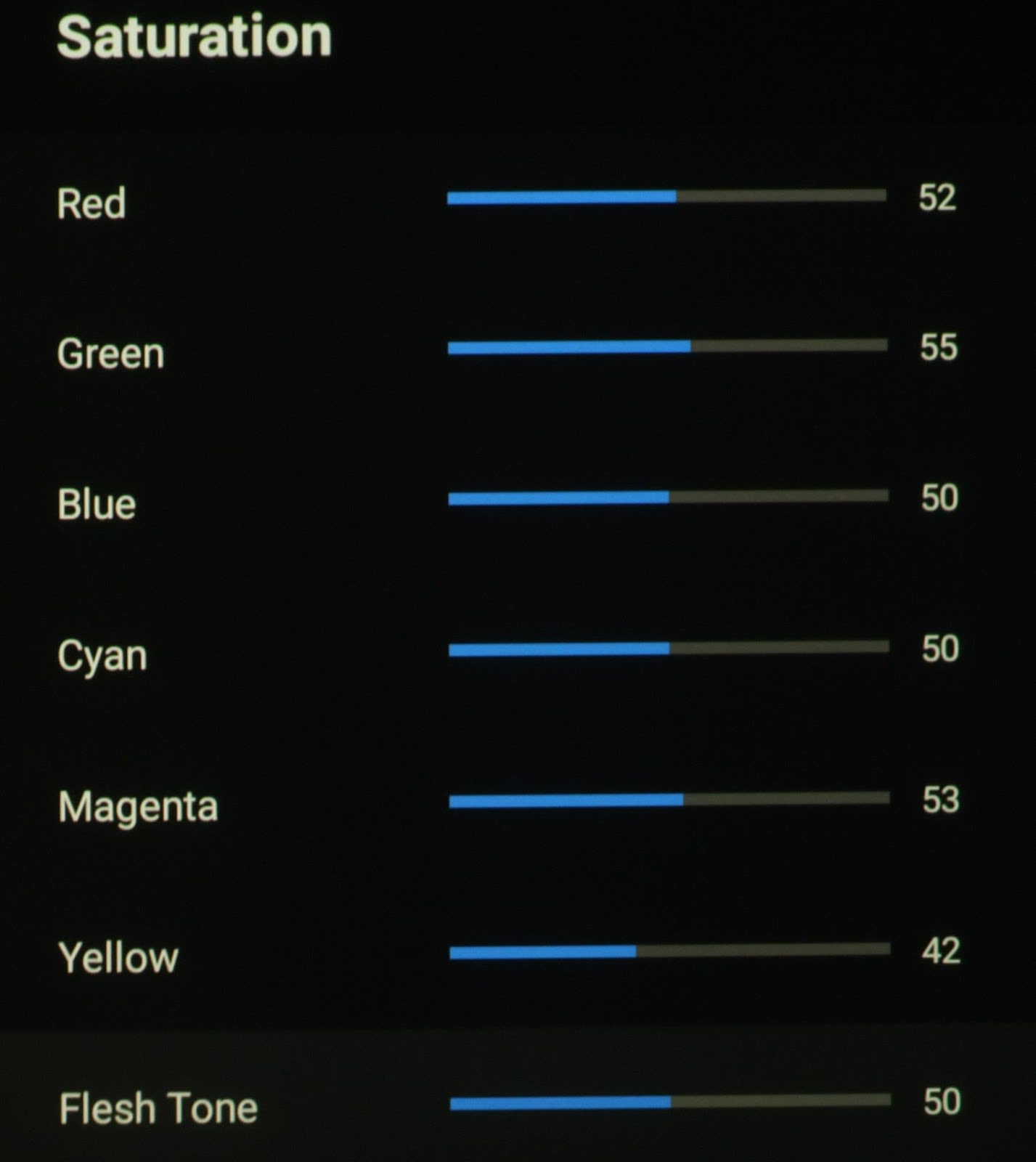
- If you do have access to a meter and software, then you can do these adjustments and measurements yourself. Here are the values I ended up with, which you can feel free to try:
SDR |
HDR |
|
|---|---|---|
HUE |
RED 48 |
RED 51 |
GREEN 49 |
GREEN 45 |
|
BLUE 50 |
BLUE 55 |
|
CYAN 50 |
CYAN 57 |
|
MAGENTA 42 |
MAGENTA 44 |
|
YELLOW 46 |
YELLOW 55 |
|
FLESH TONE 50 |
FLESH TONE 50 |
|
SATURATION |
RED 81 |
RED 52 |
GREEN 63 |
GREEN 55 |
|
BLUE 46 |
BLUE 50 |
|
CYAN 50 |
CYAN 50 |
|
MAGENTA 68 |
MAGENTA 53 |
|
YELLOW 39 |
YELLOW 42 |
|
FLESH TONE 50 |
FLESH TONE 50 |
|
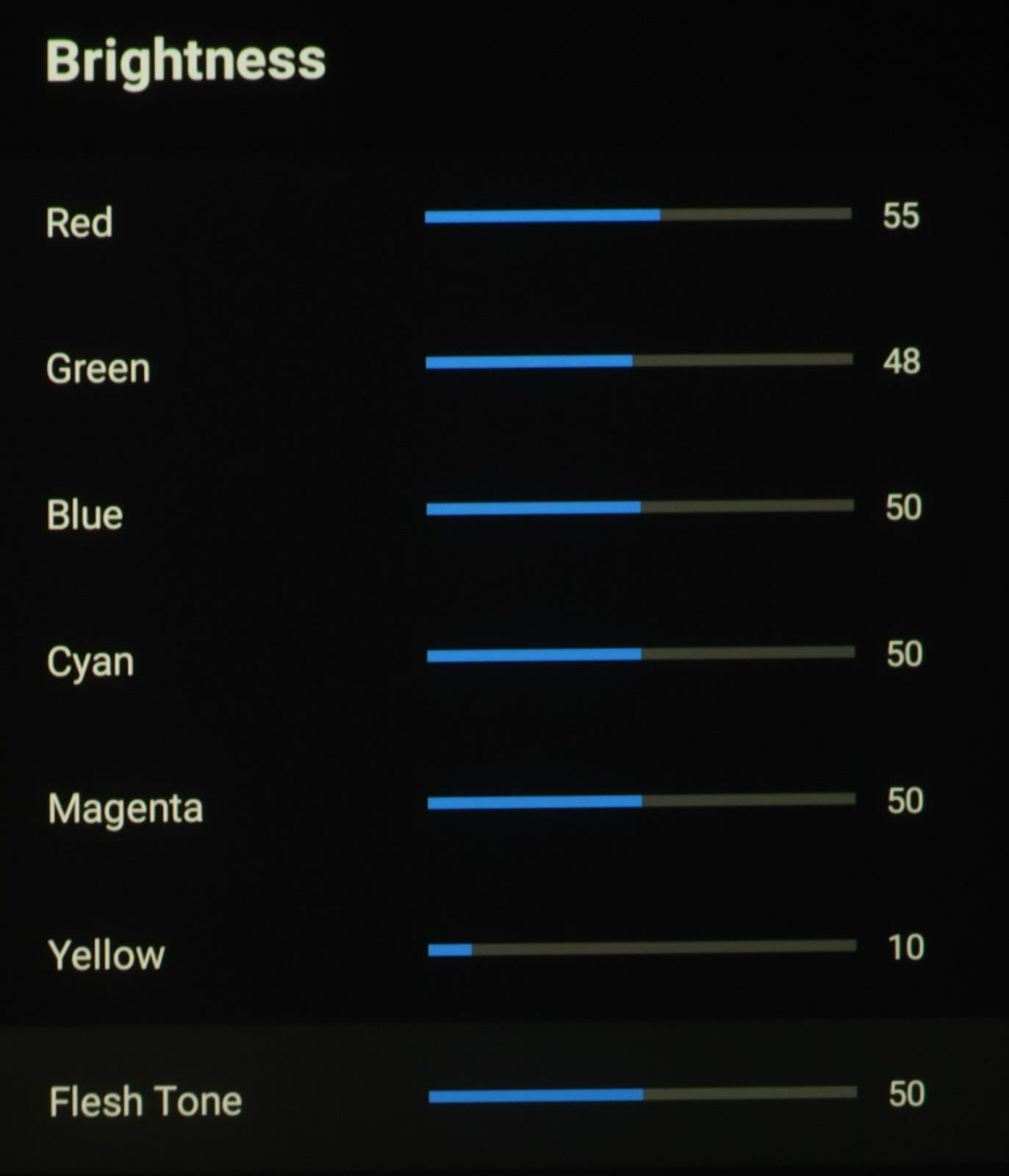
BRIGHTNESS |
RED 55 |
RED 50 |
GREEN 48 |
GREEN 59 |
|
BLUE 50 |
BLUE 50 |
|
CYAN 50 |
CYAN 84 |
|
MAGENTA 50 |
MAGENTA 50 |
|
YELLOW 10 |
YELLOW 60 |
|
FLESH TONE 50 |
FLESH TONE 50 |
|
OFFSET |
RED 50 |
RED 45 |
GREEN 50 |
GREEN 50 |
|
BLUE 51 |
BLUE 57 |
|
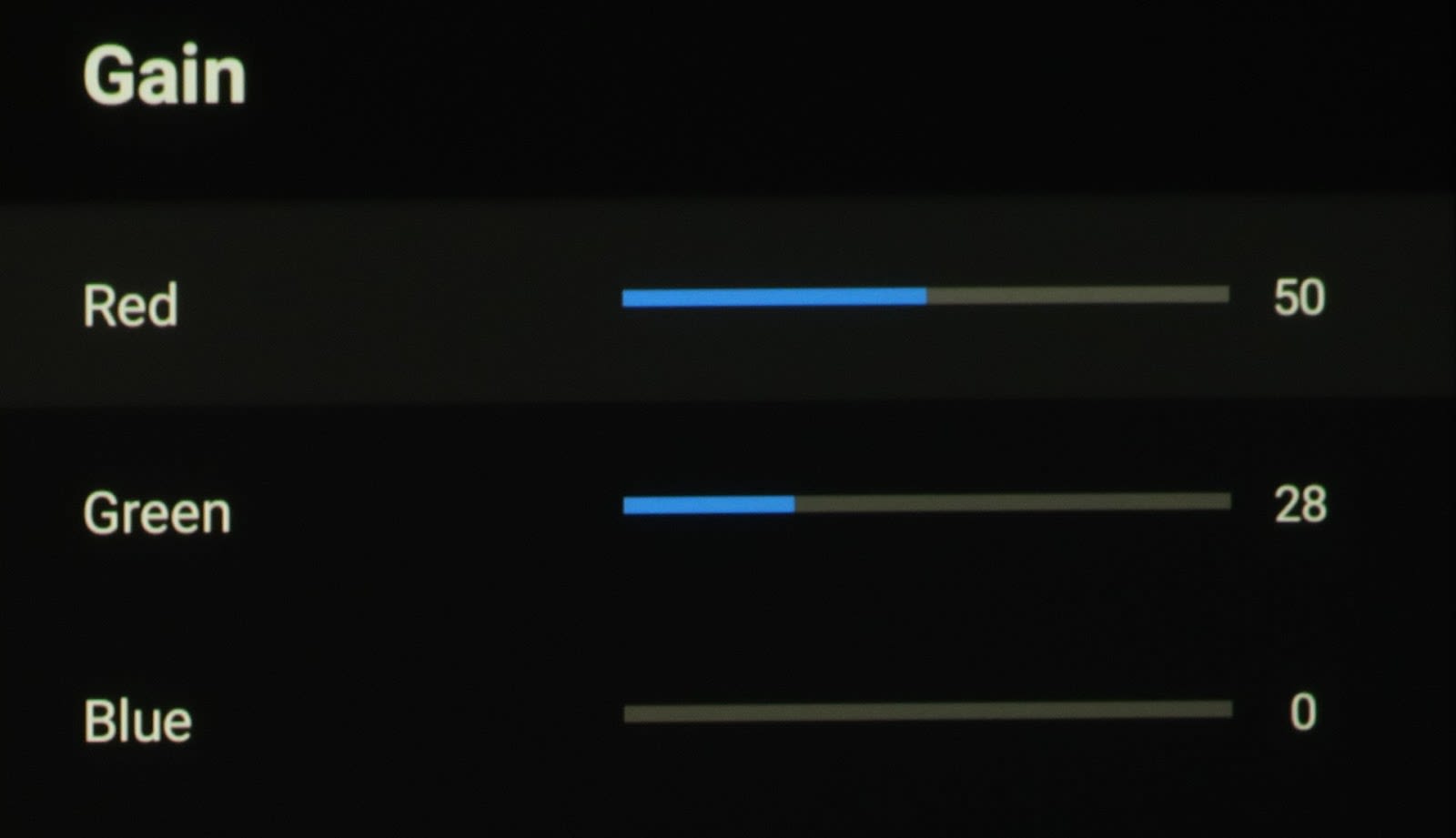
GAIN |
RED 50 |
RED 50 |
GREEN 57 |
GREEN 28 |
|
BLUE 54 |
BLUE 0 |
•11 Point white balance correction
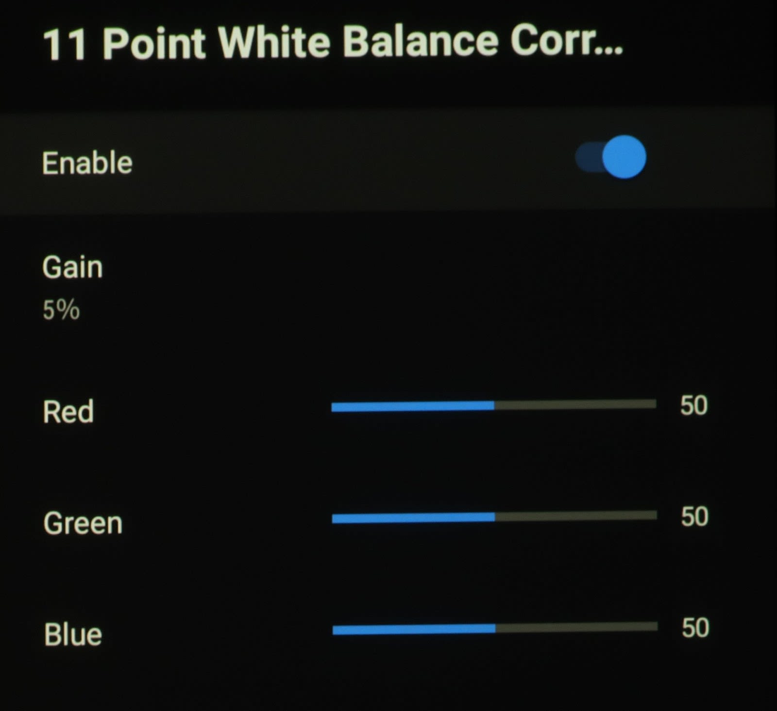

-
What is it?
- This is a way to correct each white level value at 11 points along the grayscale. (0, 5%, 10%, 20%, 30%, 40%, 50%, 60%, 70%, 80%, 90%, 100%)
-
What does it do?
- It brings your grayscale flat across the board from the lowest lows to its highest highs. It also corrects gamma.
-
When should I use it?
- You should use it whenever you notice any color temperature/white balance issues at any point along the range, which aren’t falling into their respective reference points after doing the initial basic 2 point white balance or Color Temperature setting. Doing this will also correct the gamma curve based on the value being used such as 2.0, 2.2, 2.4, etc.
-
What should I set it to?
- After setting the other relevant settings in the Formovie Theater, I didn’t need to go through the 11 Point White Balance. I was getting good performance just using the Color Temp and 2 point white balance so there was no need. I also recall in my previous calibration of this projector, when I tried using this feature I was getting strange results where if I changed one value it would affect other values and settings, mostly to the detriment of the on screen image and settings.
- My recommendation is to leave this setting off or at its default, unless you have a meter and software and good knowledge of advanced calibration techniques.
Advanced Video


•DNR

-
What is it?
- This stands for “Digital Noise Reduction”.
-
What does it do?
- This enhancement feature is designed to reduce the amount of digital noise artifacts in the image. This digital noise is usually caused by things such as compression and transmission.
-
When should I use it?
- You should use this feature if you see any compression or other digital artifacts in your image on screen. Formovie says it is used to “reduce snowflake-like noise”. This is noise that to me appears to make the image look too grainy.
-
What should I set it to?
- I leave it off for most all content, especially for mastered digital pre-recorded files and content such as disc or streaming movies, but if any noise is noticed in the image when watching video such as cable or broadcast TV, you can try it set to Low or Middle or see what the Auto setting does to clear the noise up.
•MPEG NR
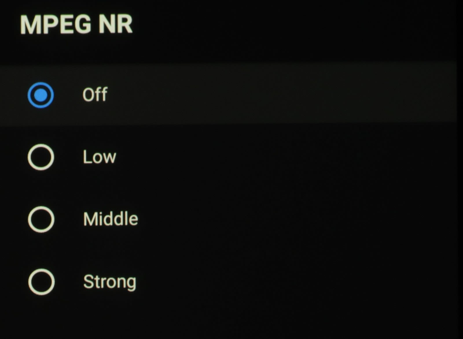
-
What is it?
- It stands for MPEG (Moving Pictures Expert Group) Noise Reduction
-
What does it do?
- This enhancement feature reduces the noise created when the original, higher quality video signal is sent through equipment which compresses the signal down to a smaller size for various broadcast, transmission or storage needs.
-
When should I use it?
- You should use this feature if you see any MPEG compression artifacts in your image on screen. This mostly shows up in lines of text where the edges can take on a digital or blocky appearance, especially when the video is in motion. Formovie says it is used for “Noise Reduction, which reduces noise around text”.
-
What should I set it to?
- Again with this “feature”, I leave it off for most content, such as disc or streaming movies, but if any MPEG noise is noticed in the image on text or object edges, you can try to set it to the Low or Middle options to see what these settings do to fix the noise. Too high of a setting will start making the image too flat and smeared in appearance, so use it sparingly.
•Max Vivid
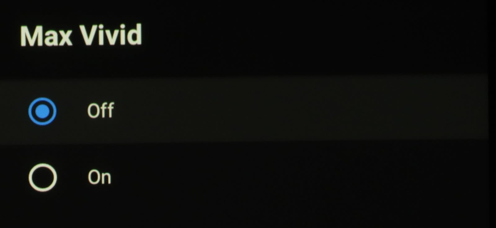
-
What does it do?
- This setting, according to Formovie, adjusts the dynamic contrast to the maximum. It is supposed to make the brighter parts of the image brighter and the darker parts darker. This setting also increases some of the color saturation.
-
When should I use it?
- You should use this setting when you want to increase the appearance of perceived contrast and richer colors to make the image have a more dynamic appearance and “pop” to it, at the expense of some crushing and clipping artifacts or an unnatural looking image.
-
What should I set it to?
- My recommendation is to leave this OFF unless you want to have a much more contrasted image with over saturated colors even if this makes the image appear more unnatural and out of reference, with side effects which can include clipping white highlights or crushing some of the black shadow details which are close to 0% video black.
•Adaptive Luma Control
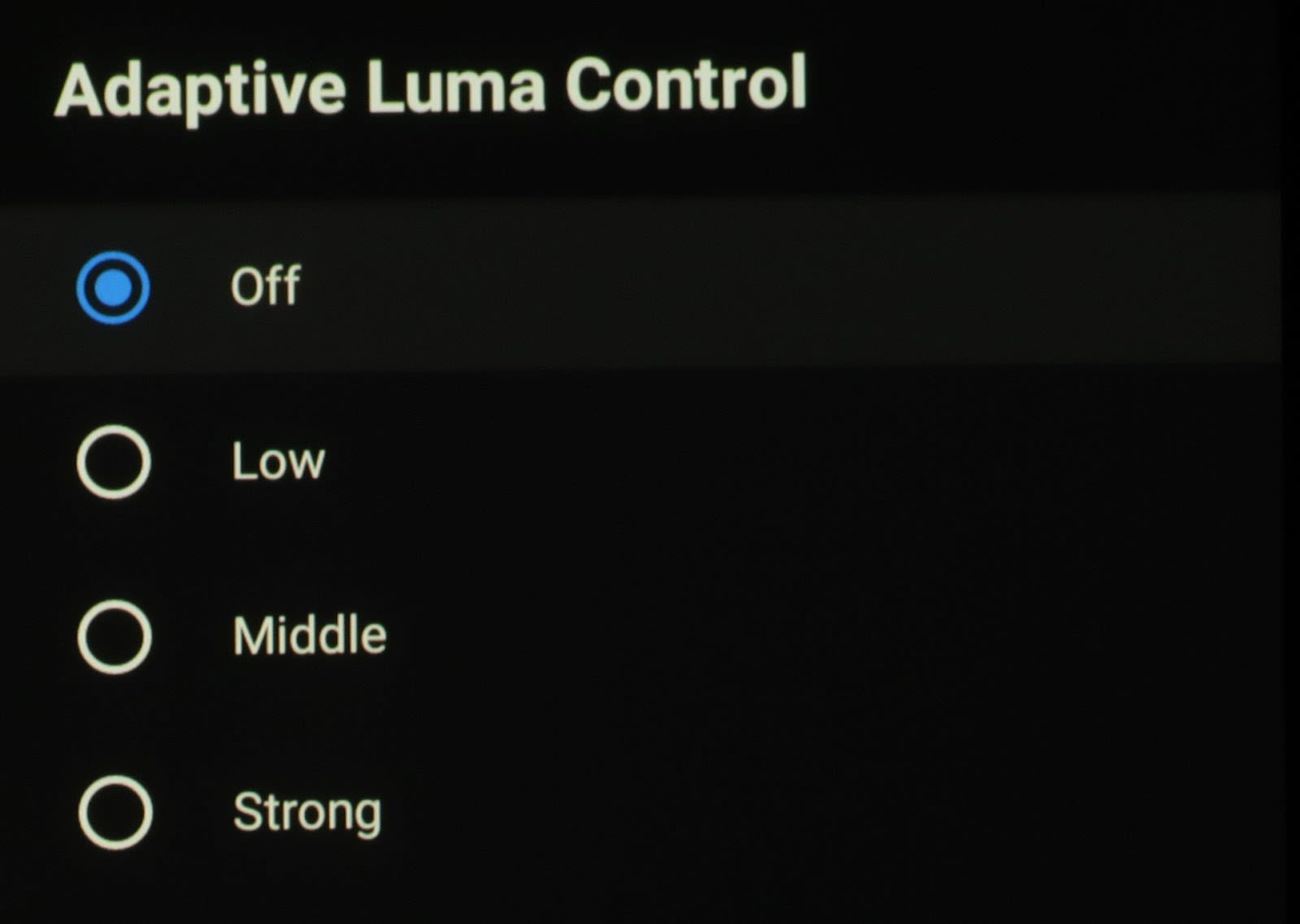
-
What is it?
- This is an automatic, per scene luminance adjustment feature.
-
What does it do?
- This feature will adjust the scene’s luminance, aka overall brightness, automatically based on the content in each scene.
-
When should I use it?
- You should use this setting to increase the appearance of perceived contrast on a scene by scene basis, to make the image have a more contrasted, dynamic appearance. As with Max Vivid for the overall video, this can cause some black crush and peak white clipping artifacts.
-
What should I set it to?
- My recommendation for this setting is to also leave it OFF unless you want to have a little more perceived contrast to the image, with similar side effects including clipping white or crushing black details depending on the content in the scene. Some scenes may not be affected so you may choose to use one of the lower settings, depending on the type of video content you’re watching.
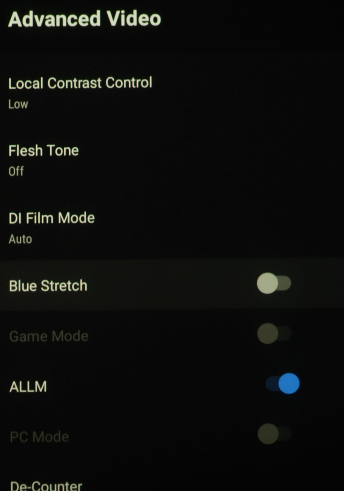
•Local Contrast Control

-
What is it?
- A setting to change contrast in specific areas of a scene
-
What does it do?
- This setting tries to increase the perceived contrast in specific areas on screen and in each scene of the video. It makes objects adjacent to each other in the scene appear to have more contrast between them, giving a more 3D and in depth type picture. Similar processing would be something like Sony’s Reality Creation or Darbee’s Visual Presence.
-
When should I use it?
- Use it judiciously when you want to try to make scenes take on a more in depth and 3D type appearance.
-
What should I set it to?
- As with all of these other feature enhancements, I recommend keeping this one OFF as well, if you want to avoid other deleterious artifacts in the image that are caused by this processing. Feel free to start with a Low setting initially and see if you like the effect it brings.
•Flesh Tone

-
What is it?
- This is a setting that affects colors in the same range as normal human skin tones.
-
What does it do?
- It brightens these skin tone colors to make them appear more natural when these colors are too saturated and have a reddish tint to them.
-
When should I use it?
- The only time I see when to use this is when you are viewing SDR video while in the Auto or OFF Color Space, which stretches the colors out and over saturates them. This will add more light/lumens to these colors which in turn brightens them up and makes them appear less saturated.
-
What should I set it to?
- I would definitely set it to OFF unless you really feel the need to try the various setting values because the skin or flesh tones don’t appear correct or pleasing in the current video you’re watching.
•DI Film Mode

-
What is it?
- This is Formovie’s version of a film mode 3:2 Pulldown setting.
-
What does it do?
- This will take a 60i or 50i input video signal and recreate the original 24, 25 or 30p signal.
-
When should I use it?
- This is best used when watching movies on something such as broadcast TV where the original broadcast format is sent in a 50 or 60 frames per second format and you want to bring back the original 24 frames per second film cadence to get a more cinematic look and feel to the motion of your video being presented.
-
What should I set it to?
- I would set this to AUTO so that when it detects a 50 or 60Hz signal, it will automatically apply 3:2 Pulldown to get as close to the original movie cadence as possible.
•Blue Stretch
-
What is it?
- A setting to increase the blue color in the image.
-
What does it do?
- It increases blue in all the associated color mixtures, giving the overall appearance a cooler image tone and blues a deeper look.
-
When should I use it?
- If you want to give your image a more pleasing tone to the eye, even if not correct. This could be a good effect for normal video type shows, especially outdoor scenes. Sports could benefit in a perceived visual sense.
-
What should I set it to?
- I recommend this setting be OFF in all instances for the most accurate rendering of video on screen, but you can use it if you feel it makes your image more appealing to you.
•Game Mode
-
What is it?
- This is the setting to use when you are playing video games and you are in a different Picture Mode than the dedicated Game Mode.
-
What does it do?
- This mode defeats as much video processing internally as it is able to do, so the lag time of the image presented on screen is as low as possible for the most responsive game play available on this projector.
- Why is it grayed out?
- This feature is grayed out in modes that aren’t able to defeat their process enough to present the image mode the way it is intended to be presented.
-
When should I use it?
- Use this feature whenever you’re playing a video game and are wanting to increase the response from the time you perform an action with the game controller and that action is shown on the screen.
-
What should I set it to?
- Set it to OFF unless playing a video game. This mode is automatically selected when in the GAME Picture Mode.
•ALLM
-
What is it?
- ALLM stands for Auto Low Latency Mode
-
What does it do?
- Auto Low Latency Mode enables the best latency setting to be automatically set. This allows for a smooth, lag-free viewing experience. When ALLM is activated, it allows a gaming console or PC to send a signal to the Formovie Theater which then causes it to automatically switch to its low-latency and low-lag Game mode for playing video games.
-
When should I use it?
- If you are a gamer and using a game console or PC for both gaming and also for disc based or streaming video, then you should activate this setting.
-
What should I set it to?
- Set this feature to ON when connected to a game console or PC as the video source. It probably won’t affect anything if you turn it on when connected to a different type of video source device to be honest.
•PC Mode
-
What is it?
- This is a mode to use when you are connected to a PC and want to display graphics without any normal video processing which can decrease the image fidelity on screen.
-
What does it do?
- When in this mode it bypasses normal picture features used for video content such as color, dynamic contrast, sharpness and other functions and the original signal from the PC is displayed for the best graphic and font reproduction possible.
- Why is it grayed out?
- This is grayed out when the input signal is not RGB or YUV 4:4:4
-
When should I use it?
- Use this feature whenever you are connected to a PC or laptop as the source input.
-
What should I set it to?
- Set it to the OFF position unless connected to a Mac, PC or laptop
•De-Counter
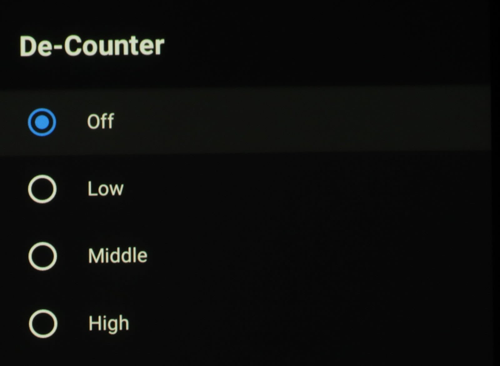
-
What is it?
- This is a setting to alleviate color banding.
-
What does it do?
- This setting actuates dithering to smooth the transition between colors, known as banding.
-
When should I use it?
- Use this feature if you are playing 8 bit video sources and you notice banding artifacts, which are usually most easily seen in sky scenes with large areas of blue in varying saturation, shades and hues.
-
What should I set it to?
- It is recommended to leave this setting OFF in normal viewing unless you see banding in your image on screen, which in this case you would turn this setting to ON to help alleviate the color bands or “ribbons”.
•MEMC
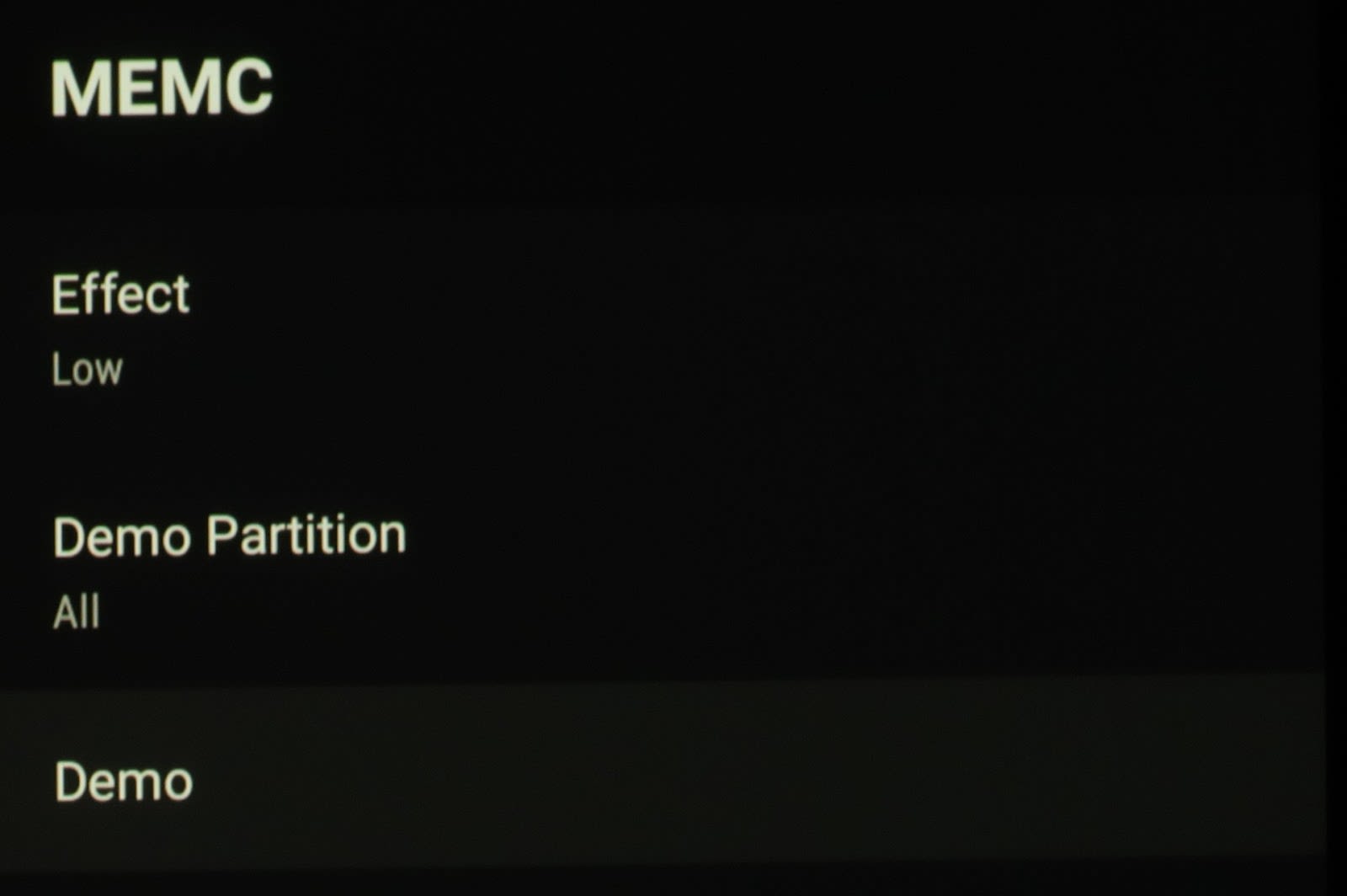

-
What is it?
- MEMC stands for Motion Estimation, Motion Compensation
-
What does it do?
- This feature helps smooth out the motion seen on screen, namely from 24Hz/frame rate movie sources which can have a stutter or judder to their motion, mostly horizontal during pans, etc.
-
When should I use it?
- You should use this feature any time that you feel the motion of your video content that you’re viewing is stuttery or has what is known as judder.
-
What should I set it to?
- I personally like the original frame rate and movie look when I am watching movies shot at 24p, so my suggestion for those that have the same “cinematic” taste would be to leave this OFF. If it does bother you then I would start with the lowest setting and work your way up from there until you are satisfied. Using too aggressive of an MEMC setting will cause what is known as the “Soap Opera Effect”, or “SOE”, which is when the image takes on a more TV like appearance, like you’re watching an old soap opera on TV, instead of the more cinematic 24p feel you’re used to seeing in theatrical movies.
•HDMI RGB Range

-
What is it?
- This is where you select the proper and matching video range for the incoming video
-
What does it do?
- This selection switches between the Full (0-255 for 8 bit) and Limited (16-235 for 8 bit) video ranges, depending on the source video being sent.
-
When should I use it?
- In most all instances this is something you shouldn’t have to think or worry about, unless you notice something not right in the image, like a washed out hazy image and you think maybe it is improperly in FULL mode when sending a Limited signal.
-
What should I set it to?
- You should always leave this in the AUTO selection so that it automatically switches between the proper format depending on what is being sent, such as a PC signal or a video signal.
•Low Blue Light
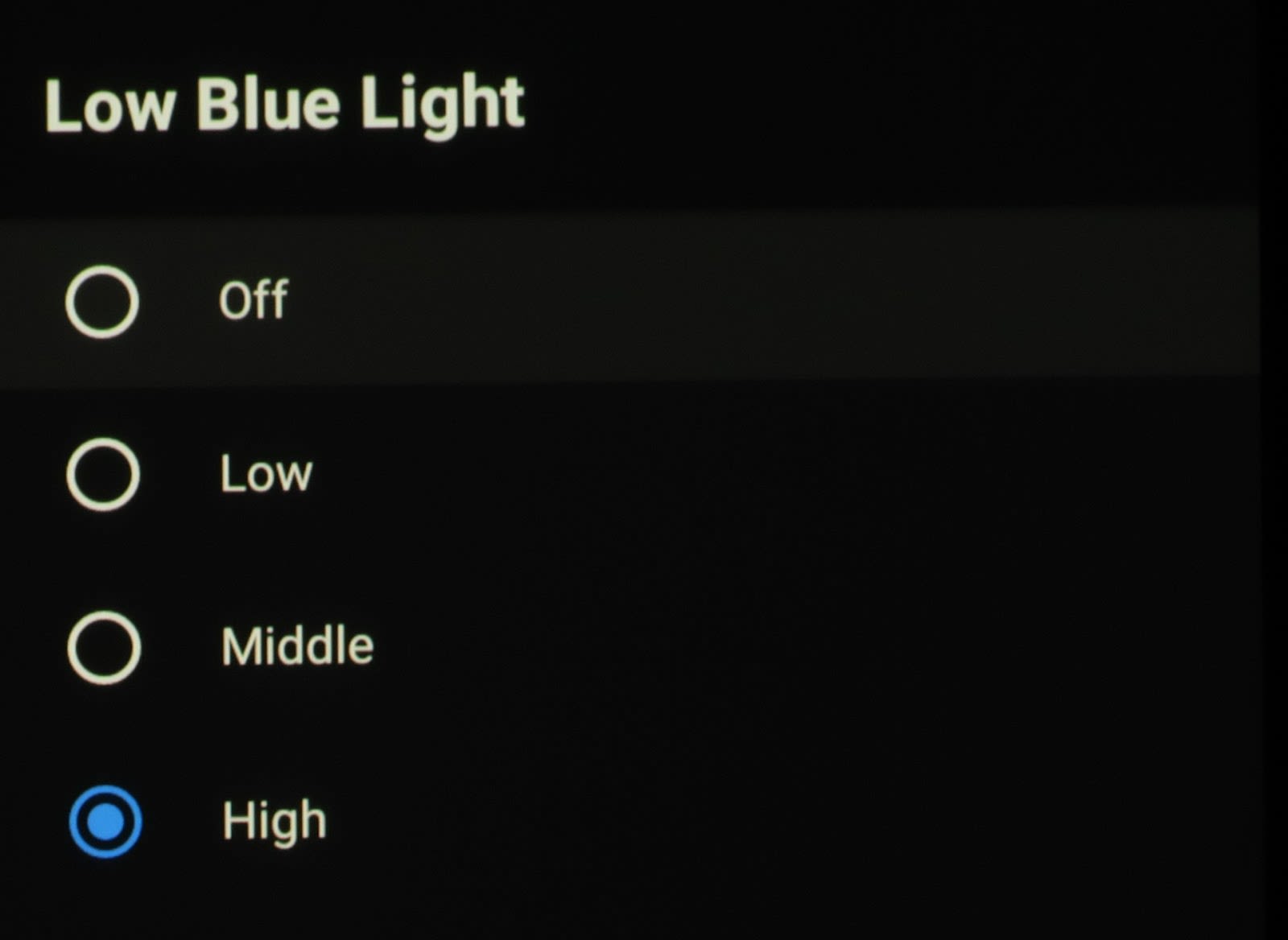
-
What is it?
- This is very similar in characteristics to the “Blue Stretch” option in that it allows you to dial down the amount of blue, cool light and color temperature in the projected image.
-
What does it do?
- This gives you four selections at different blue reduction levels to decrease the amount of blue from the lasers to a lesser and lesser extent.
-
When should I use it?
- You should use it if you want to make the video on screen appear closer and closer to reference white balance, grayscale and white point of D65.
-
What should I set it to?
- If you want it as close as possible to D65 reference white point, then you should set this to the HIGH setting in conjunction with the Color Temperature, White Balance and Grayscale Controls if you have a decent meter and calibration software. If you don’t have these then I would still use HIGH to get it as close as possible.
•Color Space
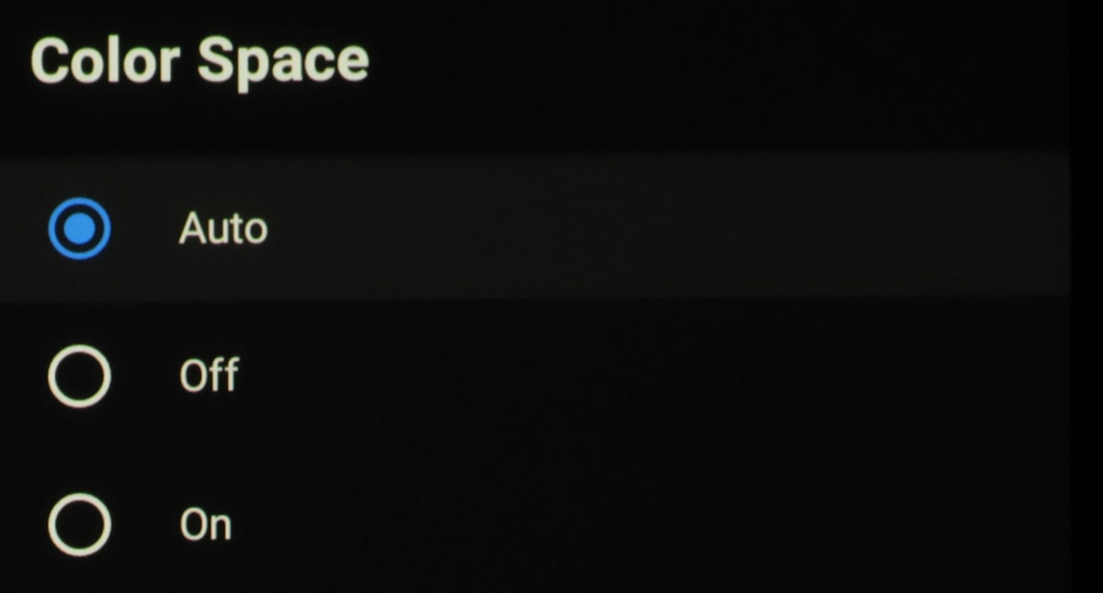
-
What is it?
- This is the setting to change the Color Space/Color Gamut option depending on the format of the video being input to the Formovie.
-
What does it do?
- It selects between the color standards assigned to different video formats such as SDR, HDR and Dolby Vision.
-
What is it?
- You should only use this option if you notice that the colors on screen appear either very washed out and muted or too vibrant and over saturated, which can mean there is a color gamut/space mismatch between the source video and the projector’s selection.
-
What should I set it to?
- This function is grayed out and not selectable when it is receiving an HDR or Dolby Vision signal. It defaults to its BT2020 gamut selection in these modes.
- When an SDR (Rec709 TV or standard Bluray) signal is being sent to the projector then it defaults to its AUTO selection for some reason, which stretches the wider percentage colors (80% and above) all the way out to BT2020. This seems to maintain the lower percentages where most of the main Rec709 colors reside, such as face/flesh tones so they don’t look too overblown in this mode, but any colors beyond about 80% are unnaturally stretched out to the full BT2020 points or beyond. The OFF setting reacts in the same manner. You would think that a setting called “AUTO” would automatically select the right color space based on the one it is receiving, but this is not the case.
- If you want the color gamut points to fall closest to their reference gamut points with SDR video input, then it is best to set this to its ON position, which then brings the color gamut points down and much closer to reference. In this setting, the Rec709 Color Sweeps are now able to be calibrated nicely throughout the gamut range.


Hi,
I used to follow the picture settings best suited for my formovie theater. But it is missing now. Can you share the link to me. Thanks!
Gopi